Media Language
The genre convention of a Tourism and Culture shows a unique and unfamiliar clothing or lifestlye. This magazine confirms this as it shows a one and only dancing uniform from Bali worn by the children, directly showing the different culture for someone foreign and traveling to Bali. The cover image features two young Balinese boys in vibrant traditional dancing costumes, creating an exotic and culturally rich atmosphere. The use of the "udeng" and Balinese masks signifies the magazine's focus on traditional Balinese culture. The bold and prominent title, "The Echo," helps establish the magazine's brand identity and capture the reader's attention.
Representations
The cover image represents Balinese culture as colorful, vibrant, and traditional, with the young boys symbolizing the richness of the island's heritage. The use of traditional attire and masks reinforces the idea that the magazine explores and celebrates Balinese traditions. The choice of this representation aims to attract readers interested in Balinese culture, tourism, and traditional arts.
Audience
The target audience for "The Echo" magazine is likely individuals interested in Balinese culture, tourism, and arts like Tourists and Foreigners. The cover image is designed to appeal to those with a curiosity about or a deep appreciation for Balinese traditions. The vibrant, culturally rich visuals and the traditional attire of the boys would likely engage individuals seeking a glimpse into the cultural aspects of Bali.
Industry
"The Echo" may consider having an online presence or supplementary digital content to complement its print edition and reach a broader audience. This digital approach allows for timely updates and broader accessibility to potential readers.
Media Language:
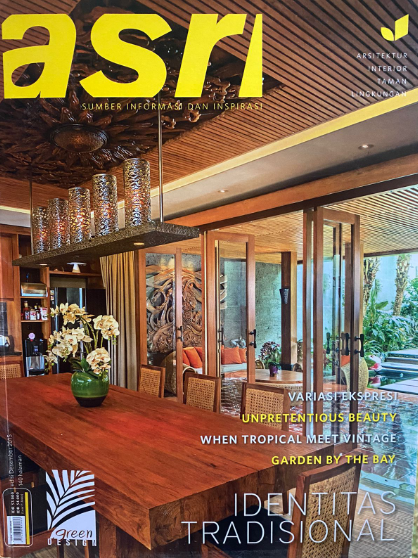
The codes and conventions of a typical interior design or
lifestyle magazine cover often feature images of well-designed spaces that
convey a sense of comfort and aesthetic appeal. In the provided cover
description, the image showcases an indoor dining area with elements commonly
found in home decor magazines. The cover prominently displays the big text "asri"
on the top left, which likely represents the magazine's producer/publisher.
This title font choice and placement suggest a modern and sleek aesthetic, in
line with the genre. The dominant brown and green colors evoke warmth and
harmony, contributing to the cozy and inviting ambiance commonly associated
with such magazines.
Representations:
The representation in this magazine cover centers on the
idea of creating an inviting and stylish interior space. The cover image
portrays a well-curated dining area with natural light, plants, and various
decor items. This representation aligns with the typical content found in
interior design and lifestyle magazines, where the focus is on providing
inspiration and ideas for readers to enhance their living spaces. The cover image
emphasizes the harmony of design and the use of natural elements, such as wood
and plants, to create an aesthetically pleasing environment. While there are no
human subjects in the image, it conveys a message of a comfortable and
welcoming space designed for relaxation and gatherings.
Audience:
The target audience for the "asri" magazine
appears to be individuals interested in interior design, home decor, and
lifestyle improvement. According to the Uses and Gratification Theory, readers
of this magazine are likely seeking information and inspiration to enhance
their living spaces. The cover's aesthetics and choice of content cater to
readers who have a curiosity about interior design and a desire to create a
comfortable and appealing home environment. The use of warm colors, natural
materials, and the arrangement of elements in the image are designed to attract
and engage those interested in these topics.
Industry:
The magazine industry, like many traditional media forms,
has adapted to the digital age. The use of a PNG format image suggests an
awareness of digital publication and online presence. The magazine may offer an
online version with additional content and features, catering to a broader
audience and keeping up with the demand for digital media. This approach allows
the magazine to extend its reach and appeal to a more diverse audience without
the need for entirely new editions. It aligns with the industry's effort to
combine traditional print media with online platforms to remain relevant and
accessible in the modern media landscape.
I find the direct gaze of the cover image towards female fashion enthusiasts to be appealing. This establishes a personal connection between the reader and the magazine, which then helps the likelihood of reader engagement. The use of the attention-grabbing term 'FREE' is also a something to note. However, in my opinion, the main image model appears somewhat obscured by the text. In my experience with previous female fashion magazines, coverlines typically follow the model's contours rather than covering a significant portion of their body. With this reasearch, I now know about the important of text and images for for the sake of grabbing people's attention
About the content, the contents page appears good. However, in the double-page spread, an excess of text with little to no . This imbalance may potentially lead to reader disinterest or boredom.

For this magazine, the cover used doesn't really attract the reader unless the person used in the picture is famous in the region that this was published in, but it might target people in the older age of 30-45. The only thing I find interesting is the popping color of the 'batik' that the man is using and the patterns it has. The image focuses on the man by having a blurred background but the man itself is covered mostly by the batik that covers if not most of the cover page. The contests page is what I like and might use in my magazine however. It is very simplistic and easy to understand. Only 1 sentence in each highlited pages, a picture and different colored borders. To finalize, the double page isn't too special but I like how it highlights the important contents to grab the people's attention to that specifcic info. I might also use a method like this for my pages.
For this magazine, The cover is something I need to copy. It shows a big view of the place the magazine is about with barely any text covering the view, this is a great idea to do as it focuses on the image which is useful to know since I am making an architecture magazine. As for the contest page, The pictures overpower the contents of the pages. This is very good as texts wont be the main focus. The main way that some people use contents is by looking at the pictures first to see what the page will be about, then reading what the it actually contains. Finally, the double page isn't that appealing. It just looks like your basic magazine double page, alot of text and some pictures. Nothing wrong but nothing too good about it either.
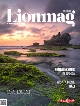
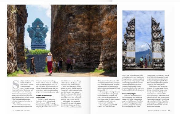
For the cover of this magazine, it again is a concept I want to use. It shows a big view of the place the magazine is about with barely any text covering the view, this is a great idea to do as it focuses on the image and beauty of the place. This magazine rely on the fact that some people may want to visit a beautiful place liek in the cover. As for the content page, only the first page has the most writing which emphasize that it is something important. But other than that, there are little to not writing and pictures that shows the reader what the pages are about easily. Finally, the double page, Its like any other double page. A big picture that needs 2 pages, and some text that art highlights the places shown in the 2 pages. Just your average magazine, nothing to unique but it sells for people interested in travelling.
Refelction: I discovered various components of magazines, including masthead, coverlines, and main cover image, each serving a distinct purpose in appealing to specific audiences. Through my research, I examined different magazines and their conventions, considering their appearance based on genre. This knowledge proved valuable in shaping my final magazine project. Evaluating the strengths and weaknesses of various magazines and incorporating those insights into my project is a straightforward process that I find enjoyable. However, the time-consuming nature of this endeavor is a drawback I don't particularly appreciate.


Comments
Post a Comment